 站长资讯网
站长资讯网本篇文章给大家带来了几种css实现垂直居中水平居中的绝对定位居中技术的相关知识,希望对大家有帮助。
Ⅰ.绝对定位居中(Absolute Centering)技术
我们经常用margin:0 auto来实现水平居中,而一直认为margin:auto不能实现垂直居中……实际上,实现垂直居中仅需要声明元素高度和下面的CSS:
.Absolute-Center { margin: auto; position: absolute; top: 0; left: 0; bottom: 0; right: 0; }
我不是这种实现方法的第一人,可能这只是非常常见的一种小技术,我斗胆将其命名为绝对居中(Absolute Centering),虽然如此,但是大多数讨论垂直居中的文章却从来不提这种方法,直到我最近浏览《How to Center Anything WithCSS》这篇文章的评论时候才发现这种用法。在评论列表中Simon和Priit都提及了此方法。
如果你有任何扩展的功能或建议,可以在此跟帖:
CodePen
SmashingMagazine
Twitter @shshaw
优点:
1.支持跨浏览器,包括IE8-IE10.
2.无需其他特殊标记,CSS代码量少
3.支持百分比%属性值和min-/max-属性
4.只用这一个类可实现任何内容块居中
5.不论是否设置padding都可居中(在不使用box-sizing属性的前提下)
6.内容块可以被重绘。
7.完美支持图片居中。
缺点:
1.必须声明高度(查看可变高度Variable Height)。
2.建议设置overflow:auto来防止内容越界溢出。(查看溢出Overflow)。
3.在Windows Phone设备上不起作用。
浏览器兼容性:
Chrome,Firefox, Safari, Mobile Safari, IE8-10.
绝对定位方法在最新版的Chrome,Firefox, Safari, Mobile Safari, IE8-10.上均测试通过。
对比表格:
绝对居中法并不是唯一的实现方法,实现垂直居中还有些其他的方法,并各有各的优势。采用哪种技术取决于你的浏览器是否支持和你使用的语言标记。这个对照表有助于你根据自己的需求做出正确的选择。

解释:
通过以上描述,绝对居中(AbsoluteCentering)的工作机理可以阐述如下:
1、在普通内容流(normal content flow)中,margin:auto的效果等同于margin-top:0;margin-bottom:0。
W3C中写道If 'margin-top', or'margin-bottom' are 'auto', their used value is 0.
2、position:absolute使绝对定位块跳出了内容流,内容流中的其余部分渲染时绝对定位部分不进行渲染。
Developer.mozilla.org:…an element that is positioned absolutely is taken out of the flow and thustakes up no space
3、为块区域设置top: 0; left: 0; bottom: 0; right: 0;将给浏览器重新分配一个边界框,此时该块block将填充其父元素的所有可用空间,父元素一般为body或者声明为position:relative;的容器。
Developer.mozilla.org:For absolutely positioned elements, the top, right, bottom, and left propertiesspecify offsets from the edge of the element's containing block (what theelement is positioned relative to).
4、 给内容块设置一个高度height或宽度width,能够防止内容块占据所有的可用空间,促使浏览器根据新的边界框重新计算margin:auto
Developer.mozilla.org: The margin of the[absolutely positioned] element is then positioned inside these offsets.
5、由于内容块被绝对定位,脱离了正常的内容流,浏览器会给margin-top,margin-bottom相同的值,使元素块在先前定义的边界内居中。
W3.org: If none of the three [top, bottom,height] are 'auto': If both 'margin-top' and 'margin-bottom' are 'auto', solvethe equation under the extra constraint that the two margins get equal values.AKA: center the block vertically
这么看来, margin:auto似乎生来就是为绝对居中(Absolute Centering)设计的,所以绝对居中(Absolute Centering)应该都兼容符合标准的现代浏览器。
简而言之(TL;DR):绝对定位元素不在普通内容流中渲染,因此margin:auto可以使内容在通过top: 0; left: 0; bottom: 0;right: 0;设置的边界内垂直居中。
居中方式:
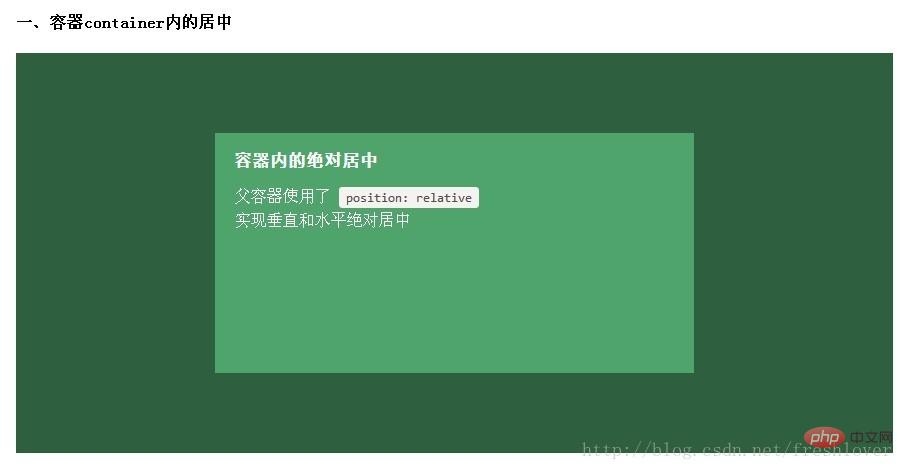
一、容器内(Within Container)
内容块的父容器设置为position:relative,使用上述绝对居中方式,可以使内容居中显示于父容器。
.Center-Container { position: relative; } .Absolute-Center { width: 50%; height: 50%; overflow: auto; margin: auto; position: absolute; top: 0; left: 0; bottom: 0; right: 0; }
以下其余的demo默认上面的CSS样式已引用包括进去,在此基础上只提供额外的类供用户追加以实现不同的功能。
二、视区内(Within Viewport)
想让内容块一直停留在可视区域内?将内容块设置为position:fixed;并设置一个较大的z-index层叠属性值。
.Absolute-Center.is-Fixed { position: fixed; z-index: 999; }
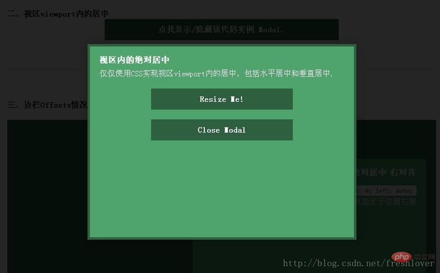
注意:对MobileSafari,若内容块不是放在设置为position:relative;的父容器中,内容块将垂直居中于整个文档,而不是可视区域内垂直居中。
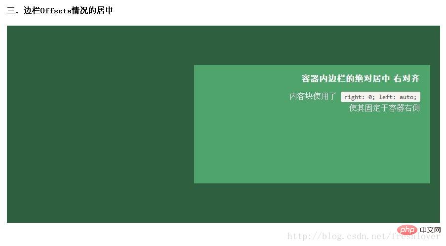
三、边栏 (Offsets)
如果你要设置一个固顶的头或增加其他的边栏,只需要在内容块的样式中加入像这样的CSS样式代码:top:70px;bottom:auto;由于已经声明了margin:auto;,该内容块将会垂直居中于你通过top,left,bottom和right属性定义的边界框内。
你可以将内容块固定与屏幕的左侧或右侧,并且保持内容块垂直居中。使用right:0;left:auto;固定于屏幕右侧,使用left:0;right:auto;固定与屏幕左侧。
.Absolute-Center.is-Right { left: auto; right: 20px; text-align: right; } .Absolute-Center.is-Left { right: auto; left: 20px; text-align: left; }
四、响应式/自适应(Responsive)
绝对居中最大的优势应该就是对百分比形式的宽高支持的非常完美。甚至min-width/max-width 和min-height/max-height这些属性在自适应盒子内的表现也和预期很一致。
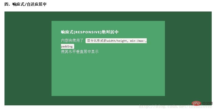
.Absolute-Center.is-Responsive { width: 60%; height: 60%; min-width: 200px; max-width: 400px; padding: 40px; }
给内容块元素加上padding也不影响内容块元素的绝对居中实现。
五、 溢出情况(Overflow)
内容高度大于块元素或容器(视区viewport或设为position:relative的父容器)会溢出,这时内容可能会显示到块与容器的外面,或者被截断出现显示不全(分别对应内容块overflow属性设置为visible和hidden的表现)。
加上overflow: auto会在内容高度超过容器高度的情况下给内容块显示滚动条而不越界。
.Absolute-Center.is-Overflow { overflow: auto; }
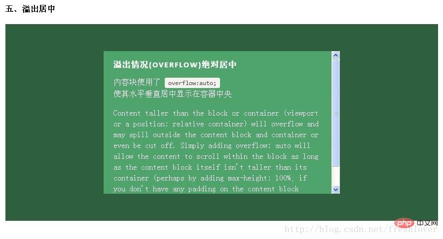
如果内容块自身不设置任何padding的话,可以设置max-height: 100%;来保证内容高度不超越容器高度。
六、重绘(Resizing)
你可以使用其他class类或javascript代码来重绘内容块同时保证居中,无须手动重新计算中心尺寸。当然,你也可以添加resize属性来让用户拖拽实现内容块的重绘。
绝对居中(Absolute Centering)可以保证内容块始终居中,无论内容块是否重绘。可以通过设置min-/max-来根据自己需要限制内容块的大小,并防止内容溢出窗口/容器。
.Absolute-Center.is-Resizable { min-width: 20%; max-width: 80%; min-height: 20%; max-height: 80%; resize: both; overflow: auto; }
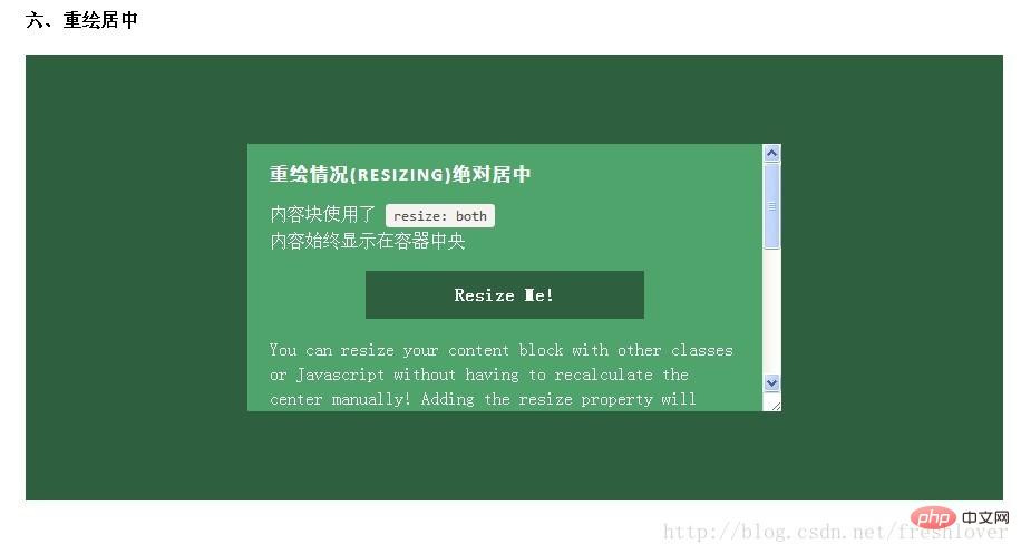
如果不使用resize:both属性,可以使用CSS3动画属性transition来实现重绘的窗口之间平滑的过渡。一定要设置overflow:auto;以防重绘的内容块尺寸小于内容的实际尺寸这种情况出现。
绝对居中(AbsoluteCentering)是唯一支持resize:both属性实现垂直居中的技术。
注意:
-
要设置max-width/max-height属性来弥补内容块padding,否则可能溢出。
-
手机浏览器和IE8-IE10浏览器不支持resize属性,所以如果对你来说,这部分用户体验很必要,务必保证对resizing你的用户有可行的退路。
-
联合使用resize 和 transition属性会在用户重绘时,产生一个transition动画延迟时间。
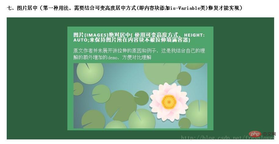
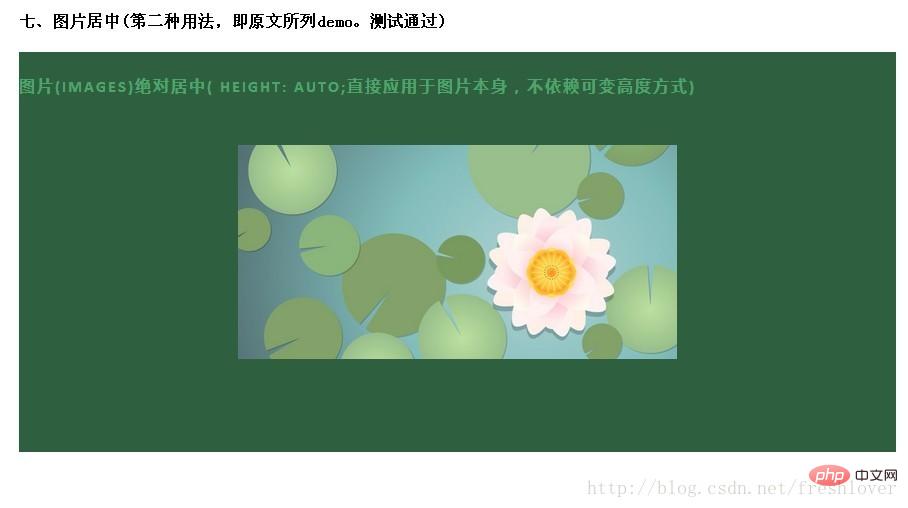
七、图片(Images)
绝对居中(AbsoluteCentering)也适用于图片。对图片自身应用class类或CSS样式,并给图片添加height:auto样式,图片会自适应居中显示,如果外层容器可以resize则随着容器的重绘,图片也相应重绘,始终保持居中。
需要注意的是height:auto虽然对图片居中有用,但如果是在图片外层的内容块上应用了height:auto则会产生一些问题:规则的内容块会被拉伸填充整个容器。这时,我们可以使用可变高度(Variable Height)方式解决这个问题。问题的原因可能是渲染图片时要计算图片高度,这就如同你自己定义了图片高度一样,浏览器得到了图片高度就不会像其他情况一样去解析margin:auto垂直居中了。所以我们最好对图片自身应用这些样式而不是父元素。
HTML:
<img src="http://placekitten.com/g/500/200" class="Absolute-Center is-Image" alt="" />
CSS:
.Absolute-Center.is-Image { height: auto; } .Absolute-Center.is-Image img { width: 100%; height: auto; }
最好是对图片自身应用此方法,效果如下图:
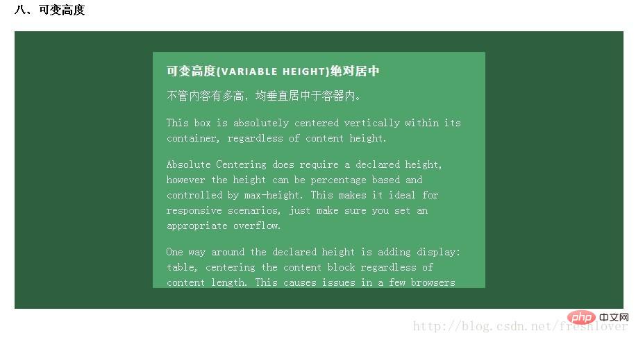
八、可变高度(Variable Height)
这种情况下实现绝对居中(AbsoluteCentering)必须要声明一个高度,不管你是基于百分比的高度还是通过max-height控制的高度,还有,别忘了设置合适的overflow属性。对自适应/响应式情景,这种方法很不错。
与声明高度效果相同的另一种方法是设置display:table;这样无论实际内容有多高,内容块都会保持居中。这种方法在一些浏览器(如IE/FireFox)上会有问题,我的搭档Kalley
在ELL Creative(访问ellcreative.com )上写了一个基于Modernizr插件的检测函数,用来检测浏览器是否支持这种居中方法,进一步增强用户体验。
Javascript:
/* Modernizr Test for Variable Height Content */ Modernizr.testStyles('#modernizr { display: table; height: 50px; width: 50px; margin: auto; position: absolute; top: 0; left: 0; bottom: 0; right: 0; }', function(elem, rule) { Modernizr.addTest('absolutecentercontent', Math.round(window.innerHeight / 2 - 25) === elem.offsetTop); });
CSS:
.absolutecentercontent .Absolute-Center.is-Variable { display: table; height: auto; }
缺点:
浏览器兼容性不太好,若Modernizr不能满足你的需求,你需要寻找其他方法解决。
1.与上述重绘(Resizing)情况的方法不兼容
2.Firefox/IE8:使用display:table会使内容块垂直居上,不过水平还是居中的。
3.IE9/10: 使用display:table会使内容块显示在容器左上角。
4.Mobile Safari:内容块垂直居中;若使用百分比宽度,水平方向居中会稍微偏离中心位置。
Ⅱ.其他居中实现技术
绝对居中(Absolute Centering)是一种非常不错的技术,除此之外还有一些方法可以满足
