 站长资讯网
站长资讯网在css中,bfc中文意思为“块级格式化上下文”,是Web页面中盒模型布局的CSS渲染模式,指一个独立的渲染区域或者说是一个隔离的独立容器。块格式化上下文包含创建它的元素内部的所有内容。

本教程操作环境:windows7系统、CSS3&&HTML5版、Dell G3电脑。
何为BFC
BFC(Block Formatting Context)块级格式化上下文,是Web页面中盒模型布局的CSS渲染模式,指一个独立的渲染区域或者说是一个隔离的独立容器。
BFC 即 Block Formatting Contexts (块级格式化上下文),属于普通流。
可以把 BFC 理解为一个封闭的大箱子,箱子内部的元素无论如何翻江倒海,都不会影响到外部。
形成BFC的条件
1、浮动元素,float 除 none 以外的值;
2、绝对定位元素,position(absolute,fixed);
3、display 为以下其中之一的值 inline-block,table-cell,table-caption、flex;
4、overflow 除了 visible 以外的值(hidden,auto,scroll);
5、body 根元素
BFC的特性
1.内部的Box会在垂直方向上一个接一个的放置。
2.垂直方向上的距离由margin决定
3.bfc的区域不会与float的元素区域重叠。
4.计算bfc的高度时,浮动元素也参与计算
5.bfc就是页面上的一个独立容器,容器里面的子元素不会影响外面元素。
实践是检验真理的唯一标准
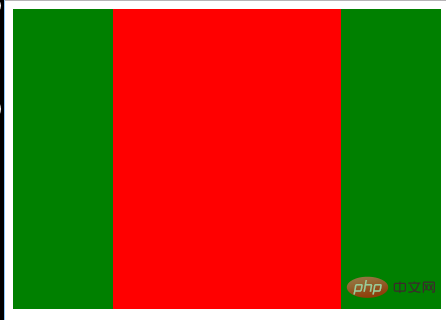
(1)BFC中的盒子对齐
特性的第一条是:内部的Box会在垂直方向上一个接一个的放置。
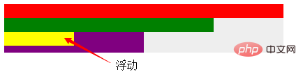
浮动的元素也是这样,box3浮动,他依然接着上一个盒子垂直排列。并且所有的盒子都左对齐。
html:
<div class="container"> <div class="box1"></div> <div class="box2"></div> <div class="box3"></div> <div class="box4"></div> </div>
div { height: 20px; } .container { position: absolute; /* 创建一个BFC环境*/ height: auto; background-color: #eee; } .box1 { width: 400px; background-color: red; } .box2 { width: 300px; background-color: green; } .box3 { width: 100px; background-color: yellow; float: left; } .box4 { width: 200px; height: 30px; background-color: purple; }
(2)外边距折叠
特性的第二条:垂直方向上的距离由margin决定
在常规文档流中,两个兄弟盒子之间的垂直距离是由他们的外边距所决定的,但不是他们的两个外边距之和,而是以较大的为准。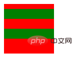
html:
<div class="container"> <div class="box"></div> <div class="box"></div> </div>
.container { overflow: hidden; width: 100px; height: 100px; background-color: red; } .box1 { height: 20px; margin: 10px 0; background-color: green; } .box2 { height: 20px; margin: 20px 0; background-color: green; }
这里我门可以看到,第一个子盒子有上边距(不会发生margin穿透的问题);两个子盒子的垂直距离为20px而不是30px,因为垂直外边距会折叠,间距以较大的为准。
那么有没有方法让垂直外边距不折叠呢?答案是:有。特性的第5条就说了:bfc就是页面上的一个独立容器,容器里面的子元素不会影响外面元素,同样外面的元素不会影响到BFC内的元素。所以就让box1或box2再处于另一个BFC中就行了。
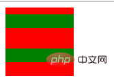
<div class="container"> <div class="wrapper"> <div class="box1"></div> </div> <div class="box2"></div> </div>
.container { overflow: hidden; width: 100px; height: 100px; background-color: red; } .wrapper { overflow: hidden; } .box1 { height: 20px; margin: 10px 0; background-color: green; } .box2 { height: 20px; margin: 20px 0; background-color: green; }
(3)不被浮动元素覆盖
以常见的两栏布局为例。
左边固定宽度,右边不设宽,因此右边的宽度自适应,随浏览器窗口大小的变化而变化。
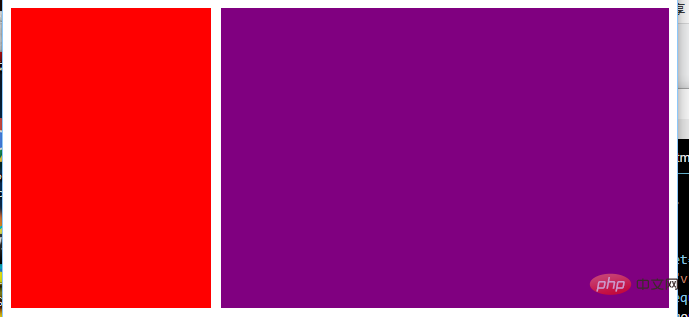
html:
<div class="column"></div> <div class="column"></div>
.column:nth-of-type(1) { float: left; width: 200px; height: 300px; margin-right: 10px; background-color: red; } .column:nth-of-type(2) { overflow: hidden;/*创建bfc */ height: 300px; background-color: purple; }
还有三栏布局。
左右两边固定宽度,中间不设宽,因此中间的宽度自适应,随浏览器的大小变化而变化。
html:
<div class="contain"> <div class="column"></div> <div class="column"></div> <div class="column"></div> </div>
.column:nth-of-type(1), .column:nth-of-type(2) { float: left; width: 100px; height: 300px; background-color: green; } .column:nth-of-type(2) { float: right; } .column:nth-of-type(3) { overflow: hidden; /*创建bfc*/ height: 300px; background-color: red; }
也可以用来防止字体环绕:
众所周知,浮动的盒子会遮盖下面的盒子,但是下面盒子里的文字是不会被遮盖的,文字反而还会环绕浮动的盒子。这也是一个比较有趣的特性。
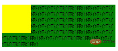
html:
<div class="left"></div> <p>你好你好你好你好你好你好你好你好你好你好你好你好你好你好你好你好你好你好你好 你好你好你好你好你好你好你好你好你好你好你好你好你好你好你好你好你好你好你好 你好你好你好你好你好你好你好你好你好你好你好你好你好你好你好你好你好你好你好你好你好你好你好 </p>
css:
(1)环绕
.left { float: left; width: 100px; height: 100px; background-color: yellow; } p { background-color: green; /* overflow: hidden; */ }
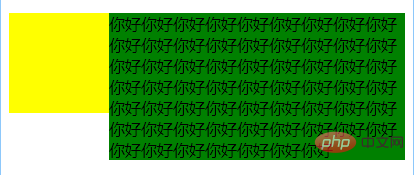
(2)利用bfc防止环绕
.left { float: left; width: 100px; height: 100px; background-color: yellow; } p { background-color: green; overflow: hidden; }
(4)BFC包含浮动的块
这个是大家再熟悉不过的了,利用overflow:hidden清除浮动嘛,因为浮动的盒子无法撑出处于标准文档流的父盒子的height。这个就不过多解释了,相信大家都早已理解。
⑵ BFC可以包含浮动的元素(清除浮动)
浮动的元素会脱离普通文档流,来看下下面一个例子:
<div style="border: 1px solid #000;"> <div style="width: 100px;height: 100px;background: #eee;float: left;"></div> </div>
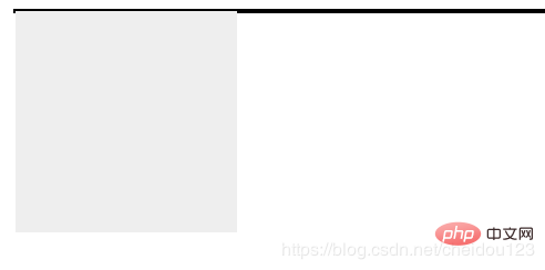
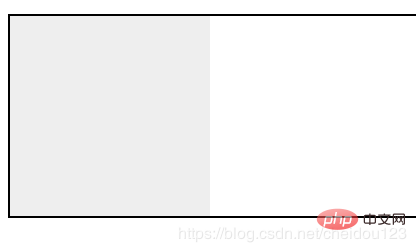
由于容器内元素浮动脱离文档流,导致容器只剩下2px边距高度,我们这时候可以采用BFC:
<div style="border: 1px solid #000;overflow: hidden"> <div style="width: 100px;height: 100px;background: #eee;float: left;"></div> </div>
⑶ 可以阻止元素被浮动元素覆盖
先看一个文字环绕效果:
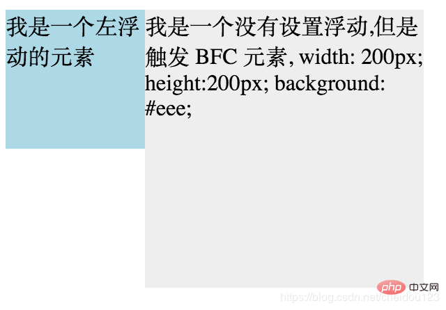
<div style="height: 100px;width: 100px;float: left;background: lightblue">我是一个左浮动的元素</div> <div style="width: 200px; height: 200px;background: #eee">我是一个没有设置浮动, 也没有触发 BFC 元素, width: 200px; height:200px; background: #eee;</div>
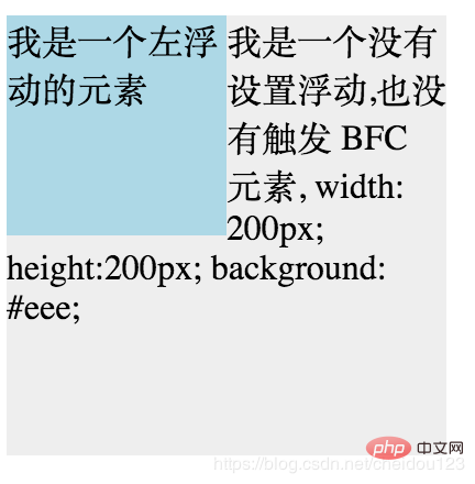
这时候其实第二个元素有部分被浮动元素所覆盖,(但是文本信息不会被浮动元素所覆盖) 如果想避免元素被覆盖,可触第二个元素的 BFC 特性,
在第二个元素中加入 overflow: hidden,就会变成:
学习视频分享:css视频教程
